Typography
Our primary typeface
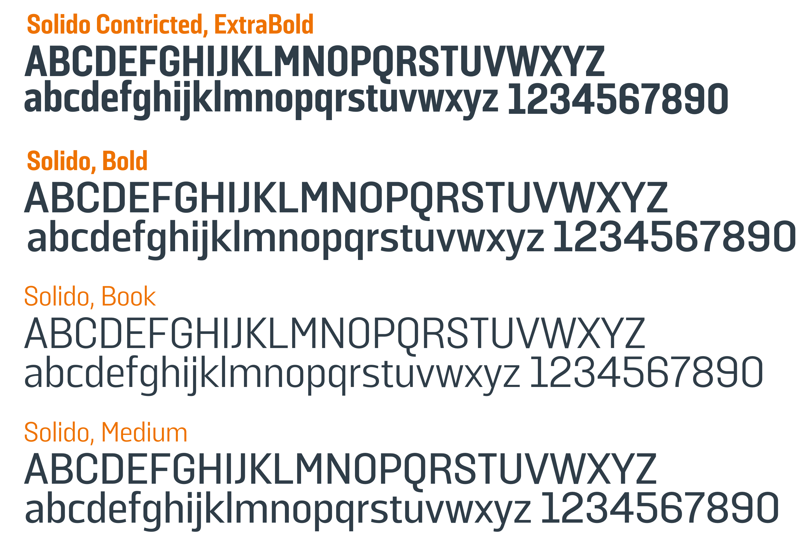
Brooke’s primary typeface is Solido.
- For headlines and titles: Solido Constricted, extra bold
- Body copy for print: Solido book (10pt)
- To download the font follow this link. Brooke has its own licence of this font with limited users; external suppliers will need to obtain their own licence.
- Keep in mind that the hierarchy of font may change.
Open source font
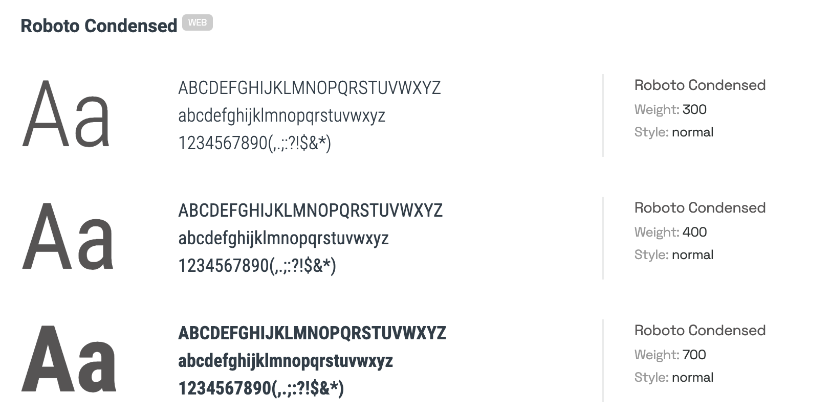
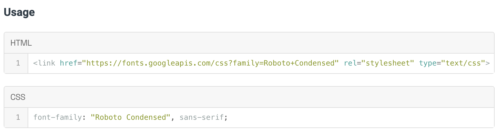
For internal use and use on digital or sharable documents and presentations, use Roboto condensed. Roboto is a Google font and is freely available and licence-free.
Typographic rules
Brooke’s typographic rules follow the WCAG AA guidelines.
Here are the rules to follow:
- Never use caps or italics for long form text
- Only use uppercase for headlines, calls-to-action and navigation
- To aid legibility, provide ample line spacing
- Try not to exceed 90 characters per line
Line spacing and text columns
The line spacing across the site is 1-1.5 (with the exception of H1s).
Use 1-1.5 line spacing to make long-form text easter to read.
We keep text columns narrow on the website to help readers track lines. If lines grow too long it can become difficult for the reader to find their place.
Accessibility rules
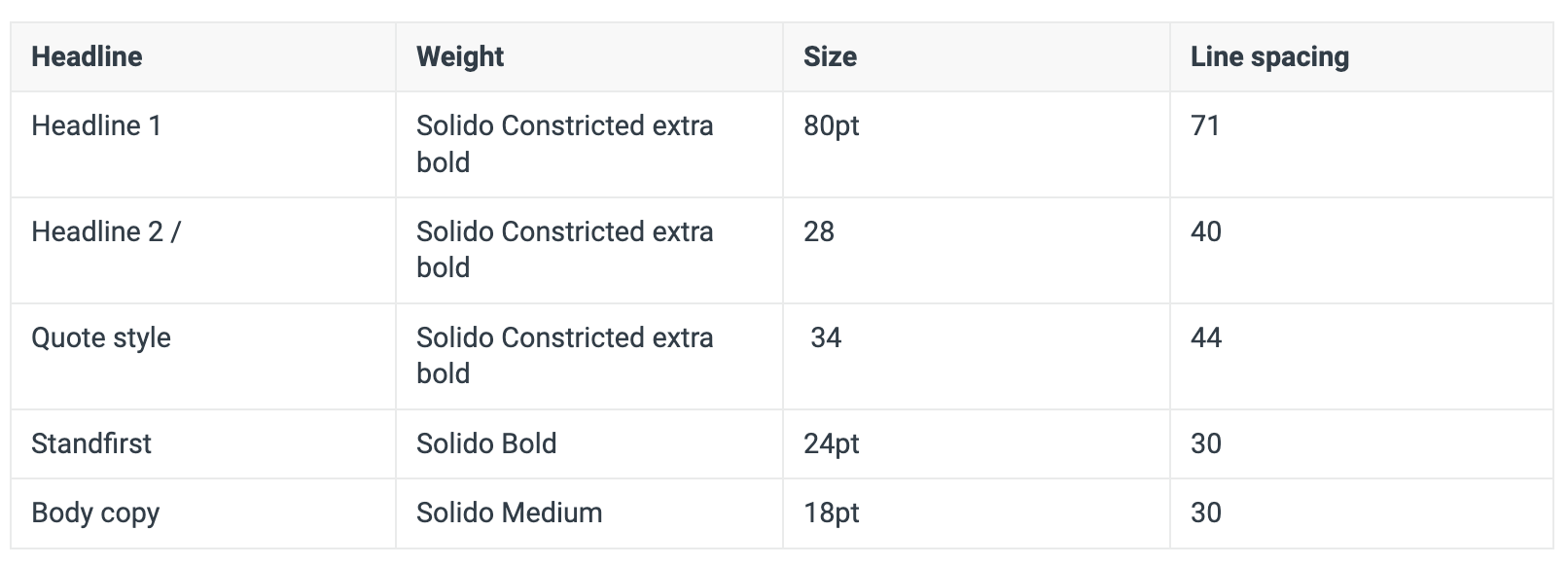
Below is an example of treatment and weighting for Brooke’s typeface to reinforce accessibility.
Use this chart for online use. For printed materials, maintain the proportions between the text style, but scale up or down the text size as needed.
Please note, our web font could change as part of the 2024 Digital User Engagement Project. Please speak to Vasil for more information.